Wish Looker Studio adopt these Power BI capabilities
Google Looker Studio (formerly Data Studio) is a great entry-level BI tool—free, browser-based, and simple for interactive dashboards. But once your reporting needs grow, many users start to feel friction: small inefficiencies, missing controls, limited formatting, and repetitive manual work.
Recently we had an opportunity to work with Microsoft Power BI because the client standardized all tools on Microsoft Azure cloud, and I would like to share my experience that makes working on Power BI a powerful experience. I wish in future, some of these features will be incorporated into Looker Studio.
A word of caution though, the two tools are primarily positioned to two different market segments, address different customer needs, and work in fundamentally different ways but there are scenarios where both can well serve your reporting / dashboarding needs (esp. in enterprise settings for executive reporting).
In this blog, we’ll cover 5 Power BI features that I found attractive to give it a serious thought for executive dashboarding (despite it being not a free tool, a basic Pro license is USD 14 per user/month,)
1. Personalizing charts to a report consumers
2. Collaborating / commenting on a report, cisual
4. What Looker Studio simply cannot report on
5. I cannot SPLIT a text in Looker Studio?
1. Personalizing charts to a report consumer
Different people interpret data differently. Some users think best when they see numbers in a simple table. Others understand trends faster when data is presented as a line chart or bar chart. These personal preferences affect how quickly and effectively someone processes information in their mind and can draw insights.
One of Power BI’s most underrated strengths is that it respects these differences. With Power BI’s “Personalize Visuals” feature, report consumers can change how a visual is displayed to them, to match their personal preference—without needing the report author to build multiple versions of the same visual.
For example: The report author may create a table to show daily sales. But if a report consumer prefers to see a more visually appealing bar chart, they can quickly switch that same table into a bar chart with just a couple of clicks. No need to edit the report, and no need to ask the author for a new version.

This small feature drastically improves:
- Speed of insight — users can choose the view that makes sense to them
- Flexibility — one report serves many different user types
- User satisfaction — people feel more in control of how they consume information
Looker Studio does not currently offer anything similar. Users are limited to the chart types the report author has already published, which reduces flexibility—especially when different stakeholders need different visual styles.
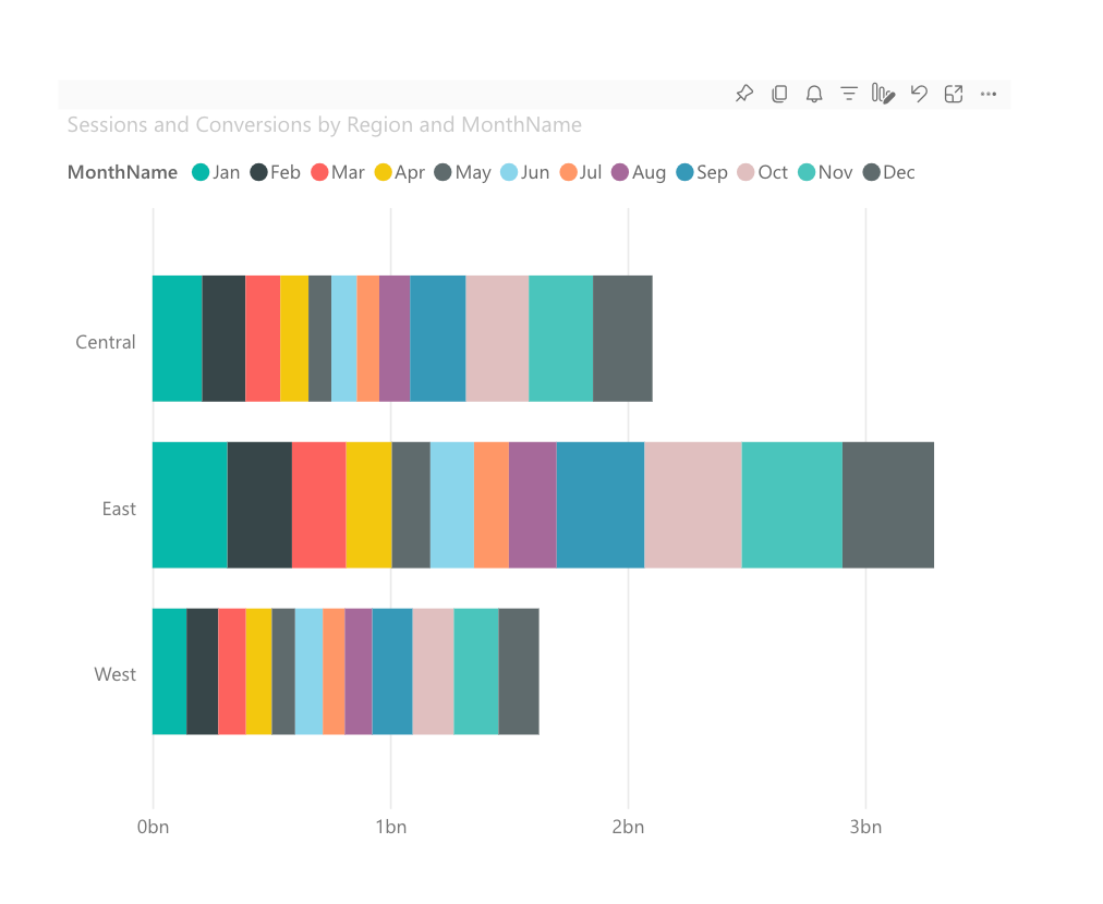
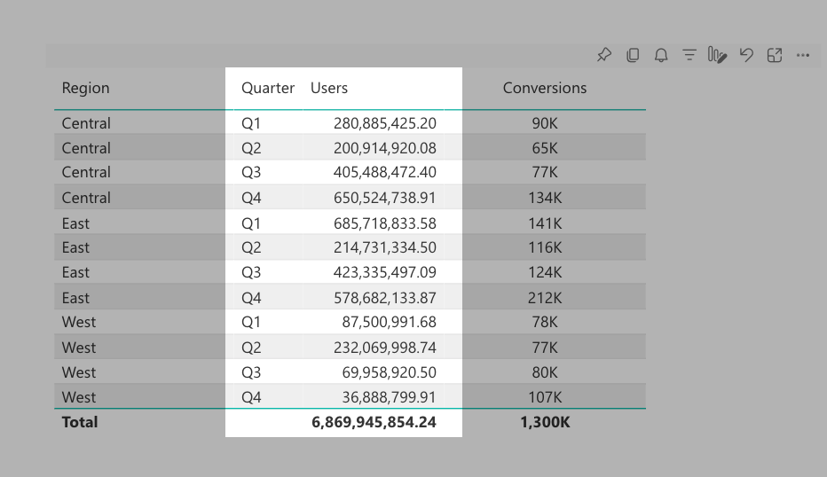
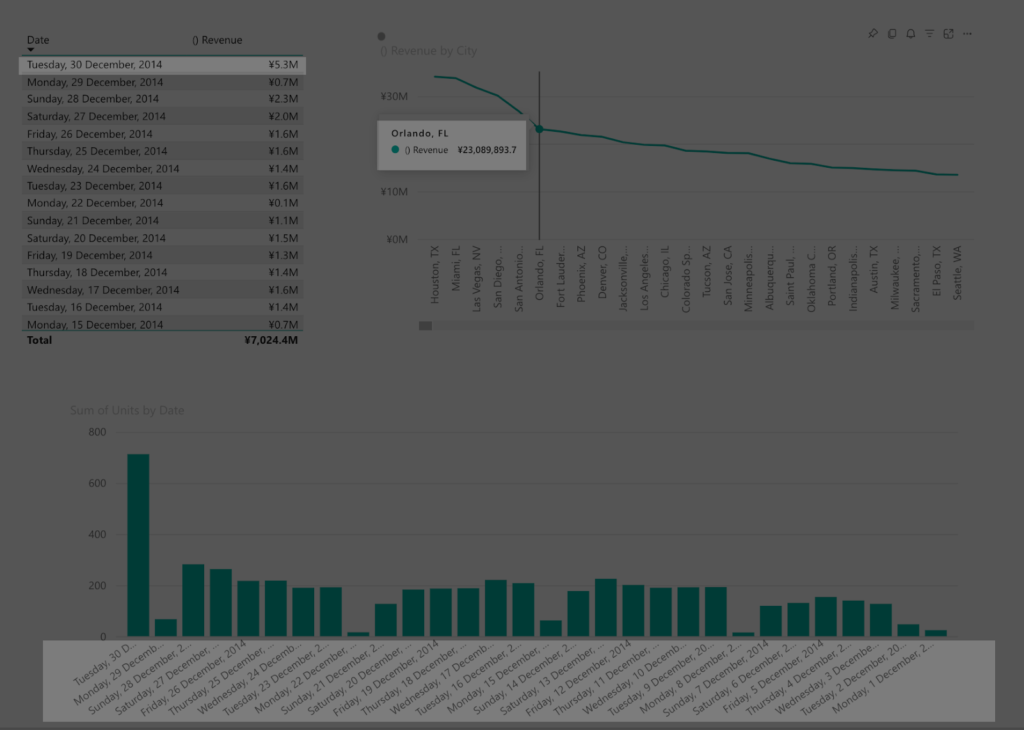
What’s more, report consumers can also “slice and dice” the data by swapping the original dimensions or metrics with new ones.
For example, instead of aggregating results by Month, they can switch to Quarter. And instead of analyzing Sessions count, they can compare Users against Conversions. Power BI lets end-users make these changes directly, without modifying the original report. This means the same table created by the report author can be personalized into a completely different view, such as the example below.
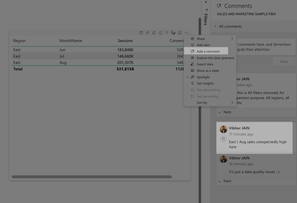
2. Collaborating / commenting on a report, visual
Power BI’s “Add comment” feature allows users to leave notes directly on a report page, or even a specific visual. These comments are threaded like a conversation and support @-mentions, letting users tag teammates and notify them instantly. Each comment also saves the exact filter and slicer state at the moment it was created, so anyone opening the comment later sees the data in the same context, preserving clarity and preventing misinterpretation.
This feature brings collaboration directly into the report environment, eliminating the need for screenshots, external chats, or long email threads. Teams can ask questions, highlight insights, flag anomalies, or request action right in the context of relevant visuals. Because conversation happens inside the data, the report becomes a shared workspace rather than a static document.
In day-to-day workflows, comments help teams move faster, make decisions with full context, and maintain a clear history of discussions and reasoning.
3. Field display format
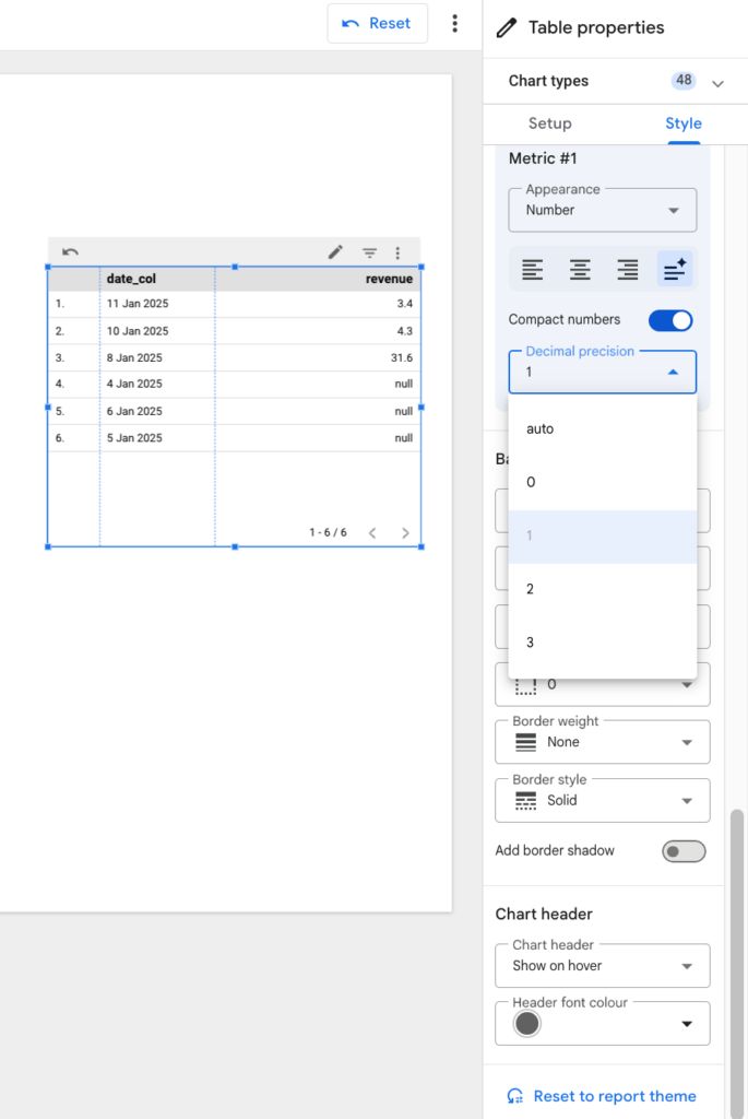
Aesthetics play a crucial role in creating visually appealing reports that are easy to read. Every field should be displayed using the correct number format and appropriate precision. Large numbers are typically easier to interpret in a compact format—such as 2K or 2M instead of 2,000 or 2,000,000—and decimals should usually be limited to one or two digits, or removed entirely when the report is already visually dense.
Compared to Looker Studio, this is much easier in Power BI by allowing authors to define formatting at the field-level—for both dimensions and metrics. Once formatting is set for each field, every visual using that field automatically inherits the same display rules. For example, you can configure a Date field to show as “Wednesday, 22 June 2005,” and set Revenue to display in with relevant Currency symbol ¥ (Japanese Yen) with 1 decimal precision

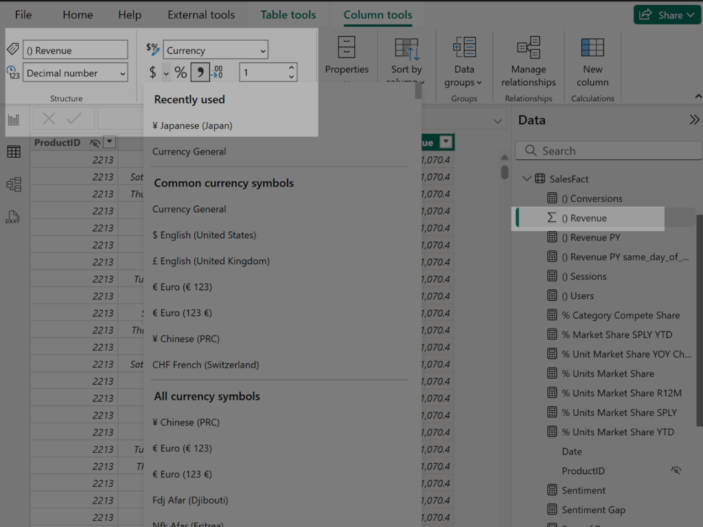
Once defined, any chart, table, or visual that uses these fields will consistently apply the exact same formatting. No need to adjust formatting for every chart repeatedly, dragging efficiency. This ensures clean, uniform presentation across the entire report, saves time, reduces manual error and helps users focus on the insight rather than deciphering inconsistent number formats.
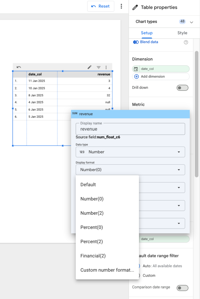
Looker Studio technically allows you to set these formats as well, but such display formatting is only at the individual chart level. If your report has 4 pages, each containing 3~4 tables or charts, and each visual includes 3~4 metric fields, you’re suddenly looking at 50 or more manual formatting steps. It’s repetitive, time-consuming, and increases the chance of inconsistency—especially in larger reports.
What’s most frustrating with Looker Studio, is after you do all this, if you change fields order within a chart (because business changes mind, and now would like to see Ad Spend column prior to revenue column!) all the formatting is gone! You have to redo (or at least re-check!) formatting for all the fields that have their ordering changed now.
4. What Looker Studio simply cannot report on
Some time ago at Ayudante, we worked on a dashboarding project where the business needed a simple Year-over-Year comparison—things like User Registrations (TY vs PY) and Revenue (TY vs PY). On the surface, this seems straightforward.
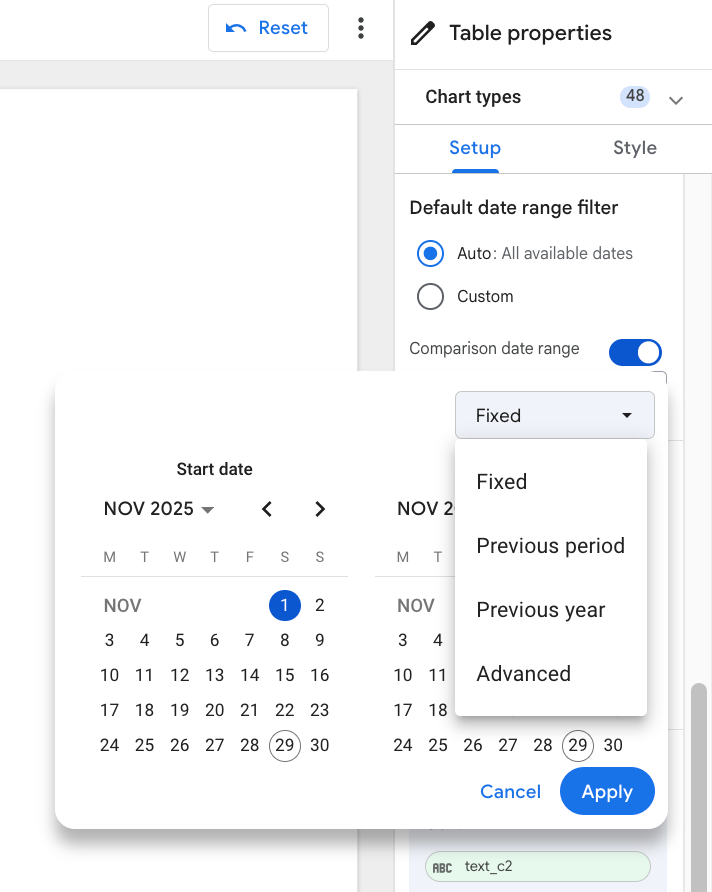
However, in certain industries, daily user engagement is heavily influenced by day-of-week patterns. The same calendar date last year often falls on a different weekday, which means comparing exact dates can lead to misleading conclusions. For example, comparing 1 Nov 2025 (Saturday) with 1 Nov 2024 (Friday) makes no sense because weekend behavior differs significantly from weekday behavior.
To solve this, the business wanted TY vs PY comparisons to align by the same weekday rather than the same calendar date. In this case, we would compare 1 Nov 2025 (Saturday) with 2 Nov 2024 (Saturday) instead, ensuring both values represent similar user-behavior conditions.
Unfortunately, this was not possible to achieve in Looker Studio because its comparative date range options are extremely limited. We eventually implemented the logic by preprocessing data in BigQuery, but the solution was far from straightforward.
Power BI, on the other hand, makes this type of comparison easy and native—directly within the BI layer—without any need for database-level preprocessing. Thanks to its powerful formula language, Data Analysis Expressions (DAX), Power BI allows authors to build flexible, complex date-logic calculations that handle scenarios like same-weekday Year-over-Year analysis with ease.

Above DAX formula expression allows us to shift the row’s current date context back by 52 weeks (364 days)—essentially moving to the same day of the week in the previous year—and then calculates the revenue for that shifted date. Instead of looking at the exact calendar date last year, it retrieves the value from the corresponding weekday last year (e.g., Saturday-to-Saturday).
And as you can see in the results, the highlighted LY vs PY values are much better aligned. In contrast, the middle column—which uses a simple “this year date vs same calendar date last year” comparison—shows numbers that are noticeably off, misleading businesses to draw incorrect conclusions about weekly performance.

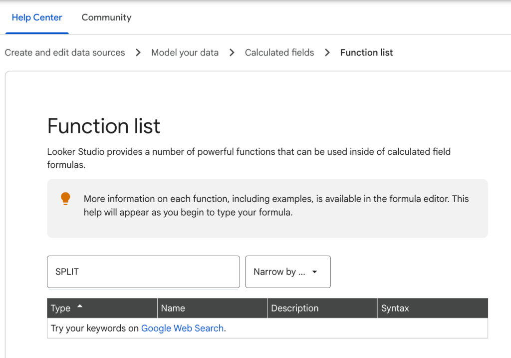
5. I cannot SPLIT a text in Looker Studio?
In our work often we need to split text at separatng character (comma , or pipe | etc.) Often collection systems are implemented to collect information encoded by such comma separated values. For ex. Product Category might be encoded as single text value “Men,Tops,Shirts”. At reporting level we might need to split at comma separator to report at each level i.e. men vs women, tops vs bottoms, shirts vs jacket vs sweaters level
To my surprise there is no SPLIT function in Looker. There are workarounds using RegEx, Google Sheets, BigQUery etc. but those are not straightforward.
Power BI provides an easy Text.Split() function that allows you to do just that when you connect to date source https://learn.microsoft.com/en-us/powerquery-m/text-split
Conclusion
While both Looker Studio and Power BI have their own strengths, working with Power BI opened up new levels of productivity once getting past the initial learning curve. Each tool serves its purpose well, and the right choice ultimately depends on the needs of the project.”