1. Forecasting – Predicting What’s Next
2. Anomaly Detection – Spotting the Unexpected (and Outliers – Finding the Odd Ones Out)
3. Smart Narrative Summaries – Let AI Do the Writing
4. Key Influencers – Understanding What Drives Results
5. Conclusion
If you’ve been using Looker Studio, you’re probably used to building dashboards that show past performance. That’s useful, but what if your reports could additionallt predict the future, flag unusual patterns, and even write summaries for you?
I couldn’t find such a feature in Looker Studio—and that’s exactly where Power BI stands out. Power BI has transformed from a tool that merely reports on historical data into a platform that empowers predictive, diagnostic, and narrative-driven analytics. Microsoft has leveraged AI and ML, making it much more than just a reporting tool, and help you move from historic reporting to predictive insights.
In this blog, we’ll cover five AI features in Power BI:
- Forecasting – Allows envisioning future trends using historical time series, with adjustable forecast length and confidence intervals—enabling proactive planning and risk mitigation
- Anomaly Detection – find unexpected spikes or dips in data. Identifies unexpected deviations in time-series data (e.g., sudden dips or spikes) with automatic explanations of potential root causes—helping quickly flag and address issues.
- Outlier Detection – highlight unusual data points. Though not a built-in visual, outlier analysis can be achieved via custom logic (e.g., DAX, scatter plots) to highlight data points that deviate significantly—ensuring data integrity and uncovering hidden trends.
- Smart Narrative Summaries – let AI write data summaries in plain English. Generates dynamic natural‑language summaries for report visuals and pages—turning dashboards into intuitive, story-rich insights.
- Key Influencers – Uses ML to rank and present the most important factors influencing specific outcomes—great for understanding performance drivers and making informed decisions.
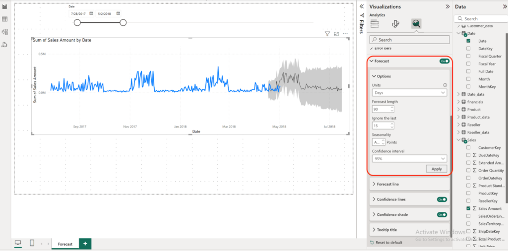
1. Forecasting – Predicting What’s Next
With Forecasting, you can ask Power BI to look at your historical data and project future values—like sales, web traffic, or customer sign-ups.
- How to use it:
- Create a line chart with a date/time axis.
- Go to the Analytics pane, turn ON Forecast, and choose how far ahead you want to predict (Forecast Length).
- You’ll also see a Confidence Interval (a shaded area) showing possible variation.
- Limitations: Works best on time-series data (like monthly or weekly sales) and needs enough past data to make a prediction.
- Customizations:
- Short vs. long-term forecasts (e.g., 3 months vs. 12 months).
- Adjust the Confidence interval (e.g., 80% vs. 95%) depending on how cautious you want to be.
- Seasonality factors are auttomatically incorporated in trends but you can still customize further, for ex. If the sales cycle repeats itself after one full year cycle, you’d input 365 (or 12, if you choose Months for the Units).
As you can see, once I change Seasonality to 30 (sales cycle repeats after every 30 days, or monthly seasonality) how the forecasting line has changed.
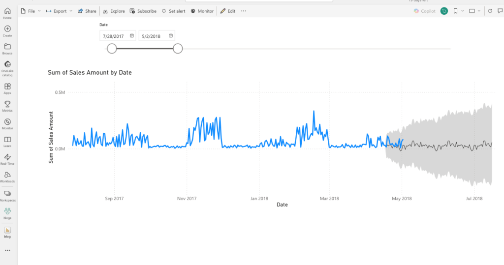
A quick note, You might be wondering why you see two overlapping lines toward the end of April 2018—the blue line (actual data) and the black line (forecast). This is called hindcasting, where Power BI compares past forecasts with actual results to validate accuracy.
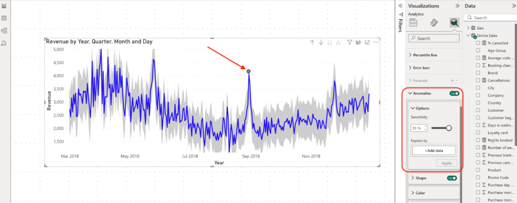
2. Anomaly Detection – Spotting the Unexpected (and Outliers – Finding the Odd Ones Out)
Ever had a sudden dip in sales or a traffic spike you didn’t expect? Anomaly Detection highlights these unusual points automatically. It can even tell you the factors that drove such unusual pattern in data for root cause analysis
- How to use it:
- Add a line chart.
- Go to the Analytics pane, turn ON Anomalies. Note: you need to turn OFF, Forecast if that’s already ON)
- Power BI marks anomalies whenever the data is outside an expected range (shaded area in the graph)
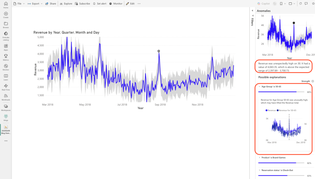
- Clicking on an anomaly, Power BI provides a natural language explanation of the factors driving it. In our case there’s only one unusual data point, and Power BI highlights the possible reasons behind it. For example
- What was expected range ( 2,397.89 ~ 3,700.73 in our case),
- Or, what factors drove anomaly: Age Group 50-65 (83%), Product (Board Games (82%). With this insight, you can go back to raw data, narrow down to specific segment and question what happened that day to drive such abnormality
- Add a line chart.
- Limitations: Works only on time-series line charts and may miss anomalies if your data is too sparse.
- Customizations:
- Adjust Sensitivity (how narrow, or wide the expected range to be and thereby how aggressively or loosely the algo should catch the animal pattern in data)
- Change the style of anomaly markers.
- Show AI-generated explanations for “why” the anomaly happened, and narrow down to specific fields that drive unusual data pattern
- Adjust Sensitivity (how narrow, or wide the expected range to be and thereby how aggressively or loosely the algo should catch the animal pattern in data)
A quick mention of a related concept to Anomaly, is as Outlier. While anomalies are useful for catching unusual or suspicious changes in time-series data, sometimes you simply want to spot values that don’t fit in with the rest of your dataset. That’s where Outliers come in. An anomaly usually signals something that’s an unusual pattern deserving root-cause analysis, while an outlier may still be a valid data point—it just sits far outside the rest of the pattern. For example:
An Anomalyー imagine a customer who normally spends $50 per day on credit card transactions but suddenly makes a $1,000 purchase. That sudden spike is an anomaly, and you’d want to flag it for potential credit card fraud.
Whereas an Outlierーconsider another customer who regularly spends $1,000 per day, while the average transaction value per user across the whole customer base is only around $200. This person isn’t showing abnormal behavior for themselves—but compared to others, they’re an outlier (spending about 5x more than the average).
In short: all anomalies are outliers, but not all outliers are anomalies.
Outliers mainly use a scatter plot or conditional formatting in a table or even Box plot, You can write simple rules (using DAX) like: “Highlight if spend is 3x higher than average, or statistical rules like standard deviation for more advanced detection.” Unfortunately, there’s no built-in “Outlier” visual; you’ll create your own rules or use R/Python if you want advanced methods.
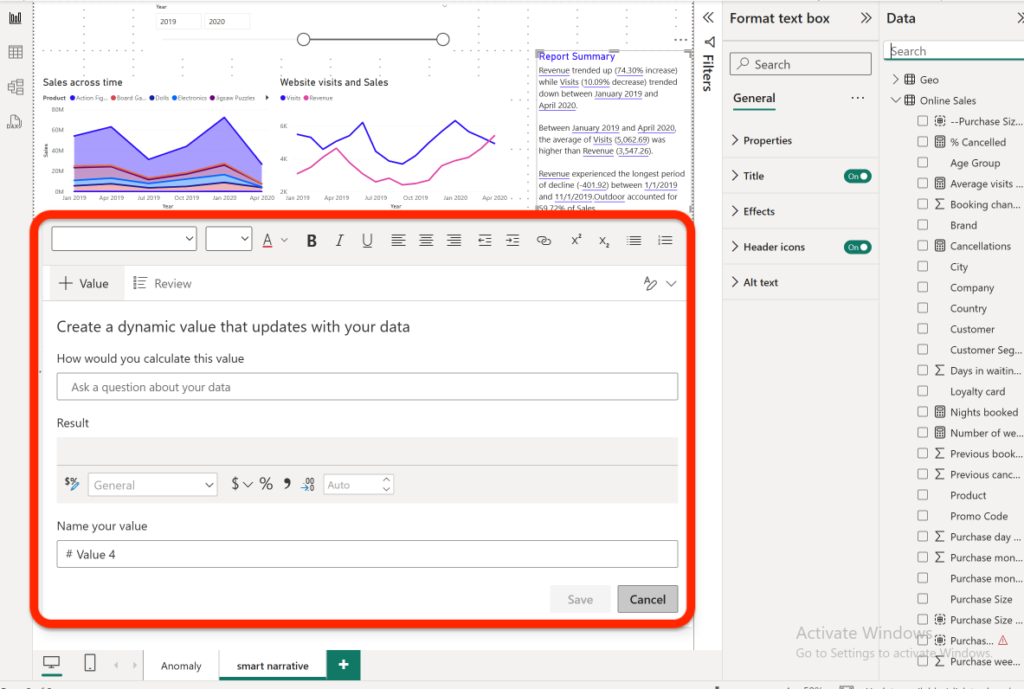
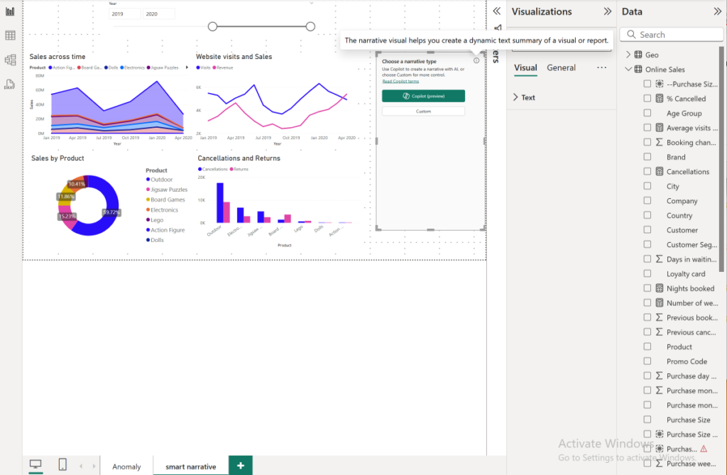
3. Smart Narrative Summaries – Let AI Do the Writing
Smart Narrative automatically generates plain-English summaries of your visuals or entire report. Perfect if you want quick explanations without writing them yourself.
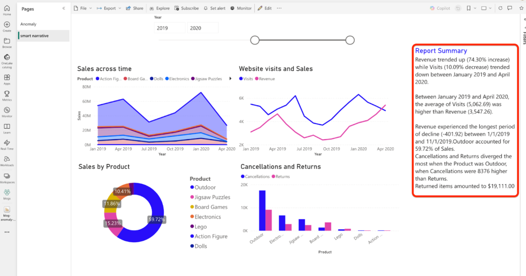
- How to use it:
- Add a Smart Narrative visual.
- Power BI creates a summary like: “Sales increased by 15% this quarter compared to last.”
- Add a Smart Narrative visual.
- Limitations: Summaries can be generic unless you tweak them. Currently works best in English.
- Customizations:
- Edit the generated text to fit your company’s tone.
- Add dynamic metrics (like year-over-year comparisons).
There’s an option to use Copilot generated text, the option is made available when you first add this visual to the report.
4. Key Influencers – Understanding What Drives Results
This visual helps you answer “What factors are influencing my results?” For example, why are customers churning, or what factors drive customer reviews / ratings ?
For example below chart tells: when a Subscription Type is “Premier”, customer Rating is 1.83x times more likely to be Low vs other Subscription Type(s)
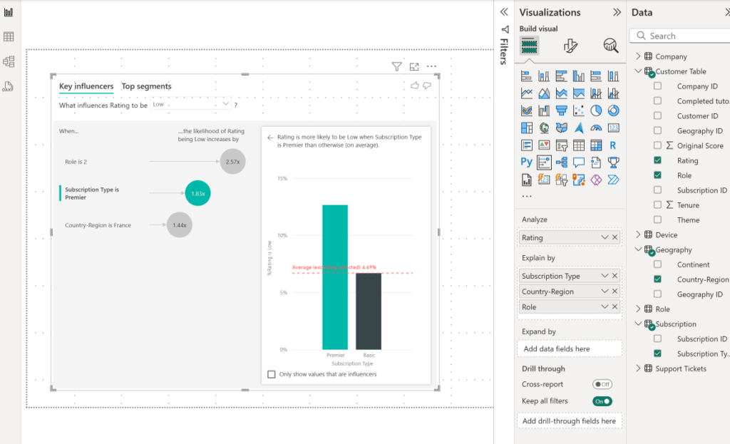
- How to use it:
- Insert the Key Influencers visual.
- Select an outcome field (e.g., “Rating = Low/High”).
- The Key Influencer visual uses logistic regression on a categorical dependent variable (such as Rating in our example) to identify patterns in the data and determine which independent variables / factors (like Role, Subscription Type, Country-region) make the difference—and by how much—in driving customers to give Low or High ratings.
- Insert the Key Influencers visual.
- Limitations: Works best with categorical data (Yes/No, High/Low, groups, segments). Won’t always capture very complex patterns.
- Customizations:
- Limit analysis to specific fields (e.g., region only).
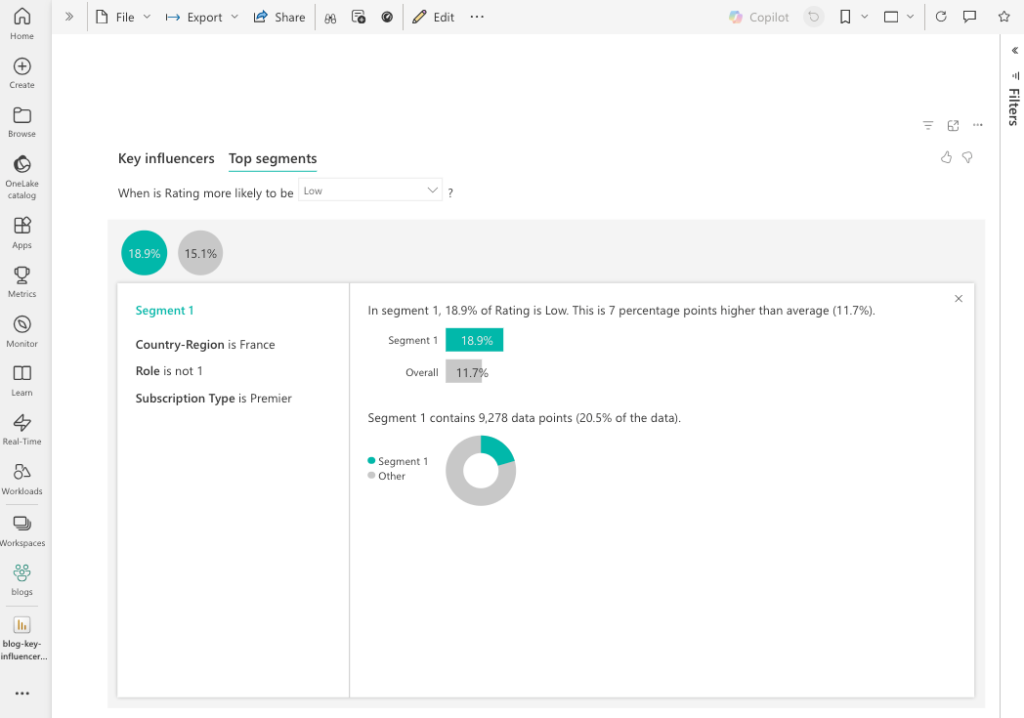
- Use the Top Segments tab to see group patterns. While the Key Influencers tab shows how each independent variable individually affects the overall outcome (the dependent variable), the Top Segments tab lets you see how a combination of several variables or factors influences the outcome you are analyzing.
- Limit analysis to specific fields (e.g., region only).
Here, for example, the group combination of “Country-Region = France”, “Role !=1”, “Subscription Type = Premier” (comprising overall 9,278 (20.5%) of all customers), results in highest % of users giving Low rating (18.9% of this segment gives Low ratings)
Conclusion
For Looker Studio users thinking about migrating, Power BI offers much more than dashboards. Features like Forecasting, Anomaly Detection, Smart Narratives, and Key Influencers bring ML, Generative AI capabilities directly into your reports for predictive analysis and take proactive steps to run your business.
You’re not just reporting on what happened—you’re anticipating what comes next, catching issues early, and explaining the “why” behind your data.
If you’re looking to take the next step in your data journey, Power BI is a powerful upgrade.